
The following table gives the number of mistakes made by 16 data entry clerks who enter medical data from case report forms. The column Entered indicates the number of values entered, and the column Errors gives the number of coding errors that were detected among these.
| Entered | Errors |
| 4434 | 35 |
| 4841 | 42 |
| 6280 | 15 |
| 1958 | 28 |
| 7749 | 36 |
| 2829 | 42 |
| 4239 | 18 |
| 3303 | 54 |
| 5706 | 34 |
| 3770 | 40 |
| 3363 | 36 |
| 1740 | 23 |
| 3404 | 27 |
| 1640 | 26 |
| 3803 | 56 |
| 1529 | 20 |
Response Variable vs explanatory variable?
Q1. Make a scatter-plot of these data. Which do you choose for the response and which for the explanatory variables? Describe any patterns.
First, what is response variable and what is explanatory variable?
| Term | Meaning | Where to plot? X or Y? |
| response variable | Dependent variable) measures an outcome of a study.Also known as “Dependent Variable” | Y |
| explanatory variable | explains or causes changes in the response variable. | X |
- Since the purpose of the given study/experiment is (/seems) to explore the effect of heavy workload on number of typing errors,
- therefore the explanatory variable is No. of Entries Entered (X-axis),
- and the response variable is No. of errors Made (Y-axis).
Now time to make the scatter plot graph.
Second (and the most important) task is getting the right “SCALE” on x and y axis.
Let’s start with the easy one: Y axis
Scale on Y axis
Take the difference between highest and lowest observation (56-15=41)
We want to take scales which are multiples of 2, 5 or 10. It makes easy to plot numbers. In this case, if we take 1cm =5 errors, then to plot 41 errors, we’d need 41/5=8+ cms. This can be accommodated easily.
So on Y axis, scale : 1 cm = 5 errors.
And in one cm there are 10mm. so 1 mm (the smallest sized box on graph)=5/10 errors= 0.5 errors. That means 2mm (set of two small sized boxes)=0.5+0.5=1 error.
Scale on X axis
- Take the difference between highest and lowest observation (7749-1529)=6220.
- A normal graph paper is about 26cm x 20cm
- But we need to cutdown 1 cm on each side to label the axis.
- So practically we’re left with only 25×19 cm.
- Now obviously very hard to plot 6220 on the shorter side of graph paper (19cm side).
- Better construct the graph as ‘landscape layout’. i.e. we’ll take longer side (25cm) as our x-axis.
- If we take 1cm =200 entries,
- Then to plot 6220 entries, we’d need 6220/200= 31+ cm. =not possible, graph can give max 26cm.
- Go even bigger
- How about 1cm=250 entries?
- In that case, to plot 6220 entries, we’d need 6220/250=24.88 = very close but sufficient.
- Ok, so on X axis, Scale: 1cm = 250 entries.
- But then how to plot numbers?
- 1cm = 250 entries, so
- 1mm (smallest greenbox)=250/10=25 entries.
- So on x axis, 10 green boxes (1cm) will go on like this:
| cm | 1 | 1.1 | 1.2 | 1.3 | 1.4 | 1.5 | 1.6 | 1.7 | 1.8 | 1.9 | 2 |
| value(no. of Entries) | 1500 | 1525 | 1550 | 1575 | 1600 | 1625(MIDPOINT) | 1650 | 1675 | 1700 | 1725 | 1750 |
Question: how to plot the (1529, 20)
Well 20 (Y axis), is very easy because the scale is big enough.
But to get 1529, mark it between 1525 and 1550. Where exactly between 1525-1550? well, no one can know! The damn graph paper is so small. Anyways no need to worry, because we have to find correlation only and no median, so 100% accuracy while plotting the data, is not necessary.
Here is the sample answer: scatter plot graph, click to enlarge

(^for illustration purpose only, this too may be containing some errors.)
Correlation between two variables?
Q2. Does the scatter-plot indicate any relation between the two variables?
If there is any relation, it’d look like one of these graphs (images taken regentsprep.org)

Our data entry graph shows no correlation because it doesn’t look like any of above four graphs.
If its still not clicking your mind, check out this excel graph of given data.
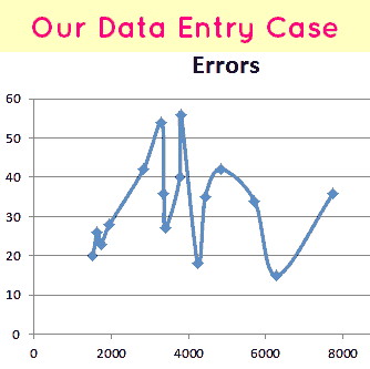
Clearly the errors are going up and down, but without any pattern.
Ans. The Scatter plot does not indicate any relation between two variables (no. of entries and no. of errors)
More work=More errors?
Q3. One analyst concluded,”The clerks who enter more values make more mistakes. Evidently they become tired as they enter more values.” Is this an appropriate conclusion?
This is analysis is flawed because of two reasons
- Reason 1. There is no correlation between No. Entries and No. of Errors, as we observed in the graph and Q2.
- Reason 2. Let’s divide work as low-workload, medium workload, high workload, according to number of entries.
| Segments | Low workload | Medium | High |
| No. of Entries | 1500-3600 | 3601-5700 | 5701-7800 |
| No of points. | 8 | 5 | 3 |
| No of errors approx. | 280 | 180 | 85 |
So, the clerks with heavy workload (more entries) are actually making less mistakes or errors compared to low-workload clerks.
![[Reasoning] Calendar Questions: Finding day or date, concepts, shortcuts explained](https://mrunal.org/wp-content/uploads/2013/01/i-lr-500x383.png)
do the points on graph paper need to be joined or not???
Since they’ve specifically asked for scatter plot graph, we cannot join those dots/points.
If question was about line graph/cumulative frequency ogive, then you’ve to join dots.
x axis 2mm = 1 error
sorry y axis 2mm = 1 error
fixed, thanks.
I answered that the scatter plot showed a distorted normal distribution. What would you say Mrunal??
what is distorted normal???? is it skewed distribution u r talking about?? scatter plot doesn’t look normal to me from any angle
Normal distribution, Skewed distribution= concepts associated with interpretation of Histograms.
Positive correlation, negative correlation or no relation= Scatter plot interpretation.
I hope clerks dont make any mistake during sorting out of UPSC marks.
While plotting, i calculated relative error (ratio of error and no of entries made) and placed it on y axis … so that i could answer Q.3 too – based on graph.
I got similar conclusions though i didnt use words like negative / +ve correlation.
Is it a correct way to plot by calculating relative error ? Ignorant of what scatter plot was – i did this logically. will i loose marks ?
While your approach is logically sound and correct but They’ve specifically asked, “Make a scatter-plot of these data. Which do you choose for the response and which for the explanatory variables?”
So one has to draw the conventional scatter plot graph, without taking any ratios.
How much will you loose, depends on your luck and his mood.
In any case, my best wishes for your mains result. :)
Seems correct. Thanks a lot.
YOU ATTEMPT THIS QUESTION………..GAZAB
Dear Mrunal,
I had made the similar graph but have joined the points after that. The analysis is also similar to your expalanation. How many marks could i loose for joining the points
Hi Mrunal,
I like to know whether u recommend any books to understand this kind of question better , or practice Statistics for Mains ??
please reply , as i m very week in this section and want to take extra care for it .
Hi Mrunal,
I like to know whether u recommend any books to understand this kind of question better , or practice Statistics for Mains ??
please reply , as i m very week in this section and want to take extra care for it .
Suday
great explanation looks like a scoring area , thanks a ton dear